


This erectile dysfunction drug was initially named Nuviva. After several rounds of revision and several name changes, the drug was released as Levitra. Yes, that was me. Ask me and I will tell you what the flame really means and the story of its evolution.
Agency: Wishbone ITP
GlaxoSmithKline and Bayer wanted to show that they drug was better, faster, and lasted longer than their competitors. In their project brief they stated “We want to see an erection in our logo.” But because of fair balance restrictions, the phallus was morphed into the flame shape it is now.
The Gladstone Institutes’ latest enterprise incorporated transparencies between research disciplines to aid in the cross-pollination of ideas. They considered this unique attribute their “fulcrum”.
Agency: Mr. Grey
The design of the BioFulcrum collateral material was co-branded with the Gladstone Institutes. The subtle use of the brand color, and more overtly, the blue bar on the bottom help unify the two brands.
I proposed designs which was separate from the identity of the Gladstone Institutes. They were lighter, more clinical, with less emphasis on blue. The bright pop colors were influenced by DNA sequencing charts.
One of my suggestions to BioFulcrum was to thank their “legacy” donors with a special cloisonne pins to identify their status at Gladstone functions and events.
The new company needed very little marketing materials, so the identity manual created was short and to the point with just enough information for the internal design studio.
The success of the BioFulcrum lead to more work with the Gladstone Institute. Named after the Greek character who created the labyrinth which entrapped the Minotaur, DaedalusBio focused on using Alzheimer’s research to aid other neurological disease research
Agency: Mr. Grey
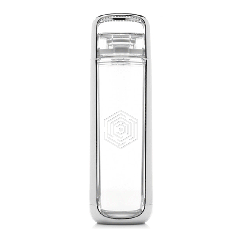
Initially, screen graphics were the most important asset for DaedalusBio’s initial presentations. For such instances the logo was presented with an extend pattern of the labyrinth. Though shown here as just PowerPoint graphic, the pattern was used in other print and digital projects.
Suggestions for company gifts were practical, stylish, and “techy”. The symbol looks striking and appropriate on a Kor water bottle or a Moleskine notebook.
Gladstone continued with their enterprises with Cure Network Ventures. The new start-up concentrated on networking scientists working on similar research hoping to to aid in scientific discovery.
Agency: Mr. Grey
Thought all three Gladstone enterprises have similar colors and typography, the Cure Network Ventures identity concentrated on creating transparencies (simulated or actual) to reflect the transparency of research done by the company.
Suggestions for the collateral material was to take a lighter more transparent tone and that imagery centered around human interactions rather on the science.
The bioscience start-up needed a corporate logo as well as three others to represent their main areas of research for Duchenne muscular dystrophy.
Agency: Nutshell Strategy
The logo for this website is targeted to the underserved audience of Hispanic diabetes patients. The aim of the logo is to help motivate the audience, with a warrior spirit, to control their blood sugar thru diet, exercise, and proper medication.
Agency: Mr. Grey